

Pool Tile Sans
DIPPING TOES INTO THE DISCIPLINE OF TYPE DESIGN

A GOOD PLACE TO WADE IN
Type design might as well be sorcery
As a seasoned typographer, I’ll be honest—the discipline of type design might as well be sorcery. Pure magic. So many moving parts.Display typefaces, however, are a bit more forgiving in their character sets and necessary polish. I thought it was about time to give one a try.
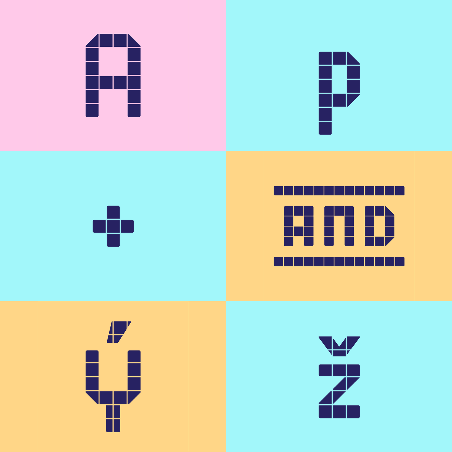
YOU CAN ALMOST SMELL THE CHLORINE
From a (seemingly) simple kit of parts
The idea for Pool Tile Sans was based upon modular letterforms built out of tile surrounding a public pool. There’s something charmingly utilitarian about the forms; the message is infinitely more important than the aesthetics. No Diving. Shallow. Depth 4 ft–0 in.The optical adjustments and nuances of certain letterforms turned this exercise into a larger-than-expected effort. That aside, it was an enjoyable puzzle to solve—an enlightening first foray into crafting a display typeface.The design features uppercase, lowercase, diacritics, catchwords, and ornaments.


THE FACE STARTS TALKING
A narrow idea with room to move
The specimen work moves from alphabet and word studies into denser settings, letting the system prove itself at different scales without disguising where it came from. The finished face keeps the tiled, public-space character of its source while becoming a usable display system.


THE GLYPH SET
The useful oddballs
A modular alphabet is only convincing when it survives the characters that do not want to cooperate. Fleurons, accents, punctuation, currency, and a handful of especially stubborn letters became the real test of the system.


