VernaculaR Circles.
A visual survey celebrating an honest, workhorse of commercial art: the milk cap.
Why milk caps?
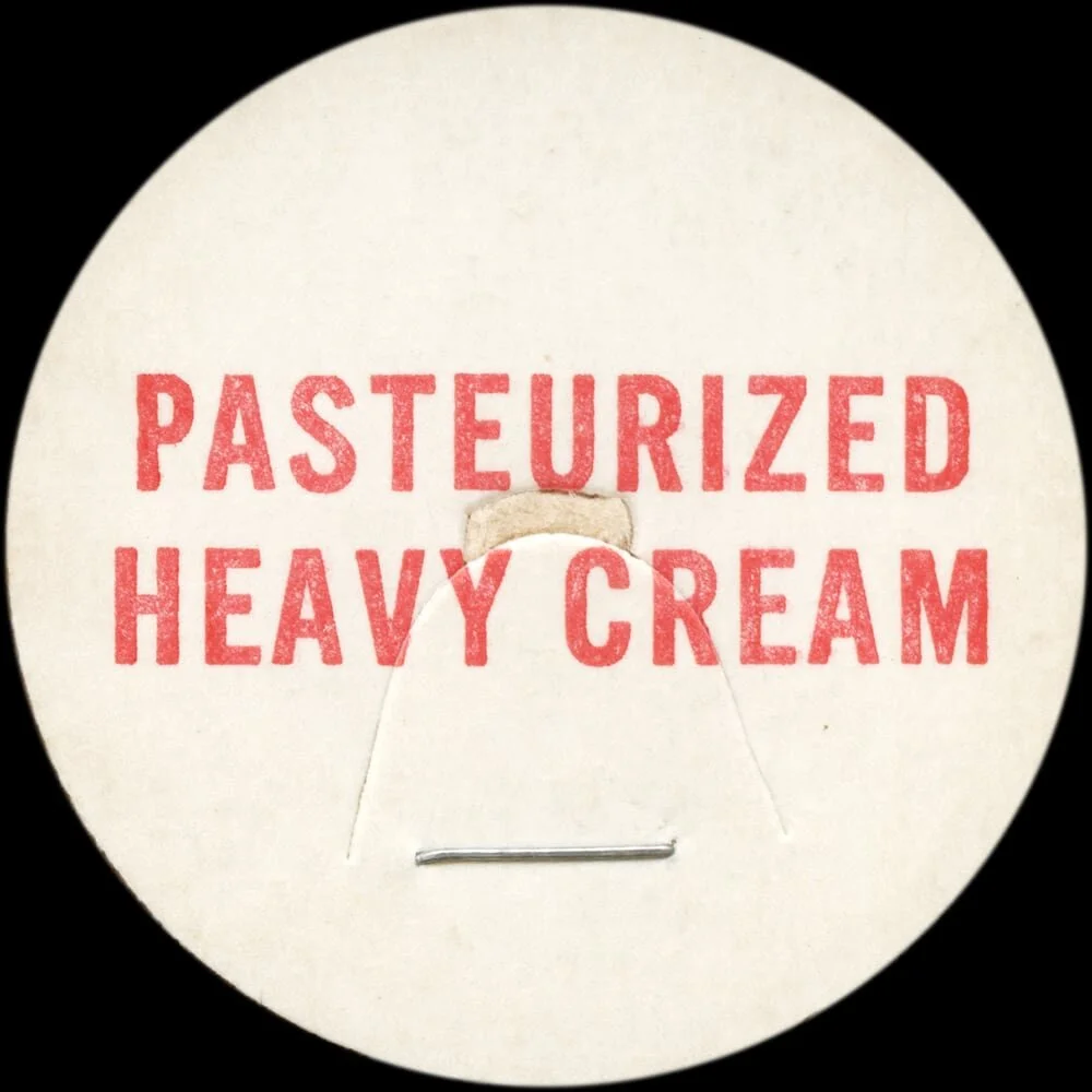
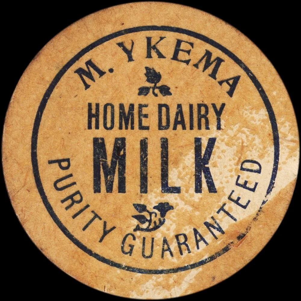
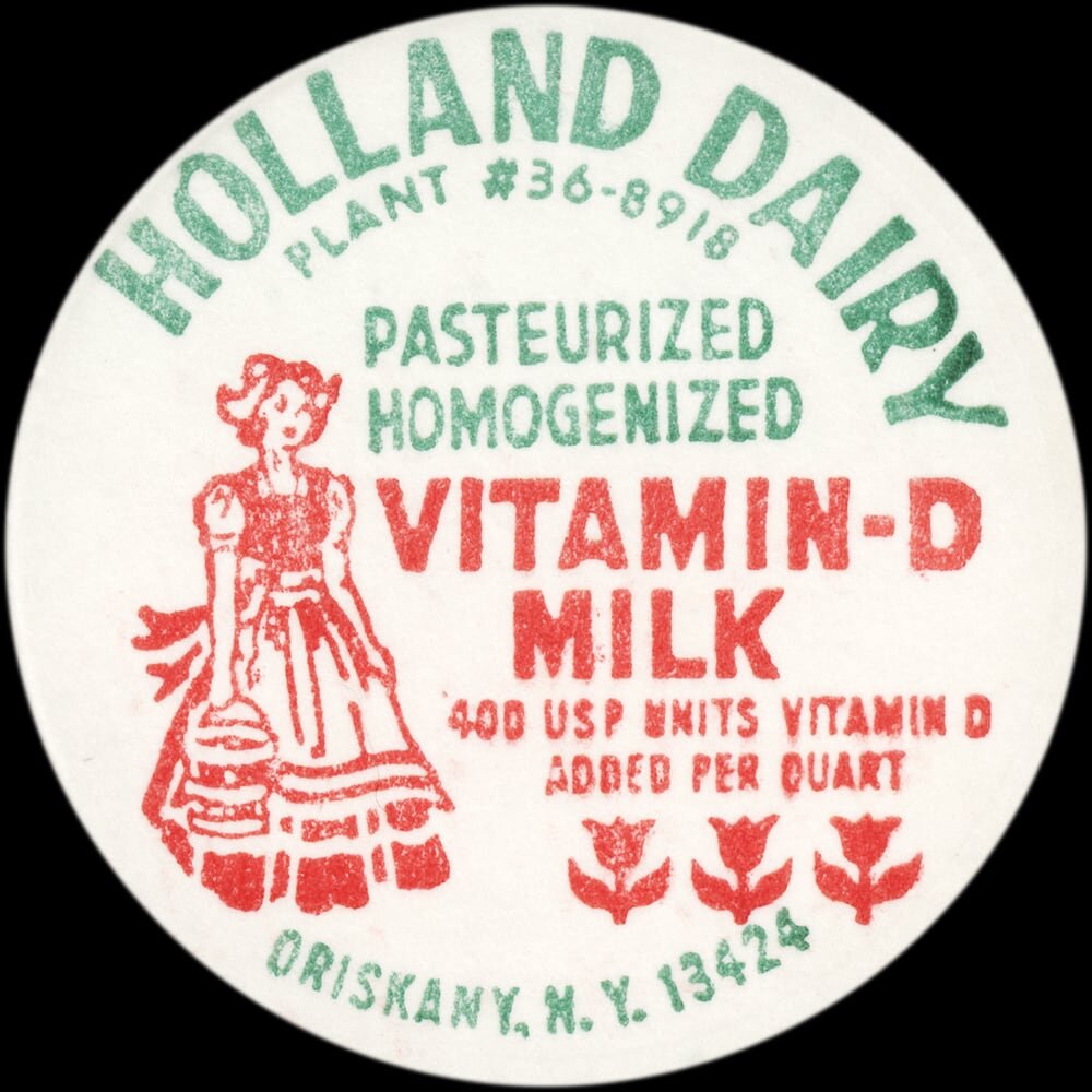
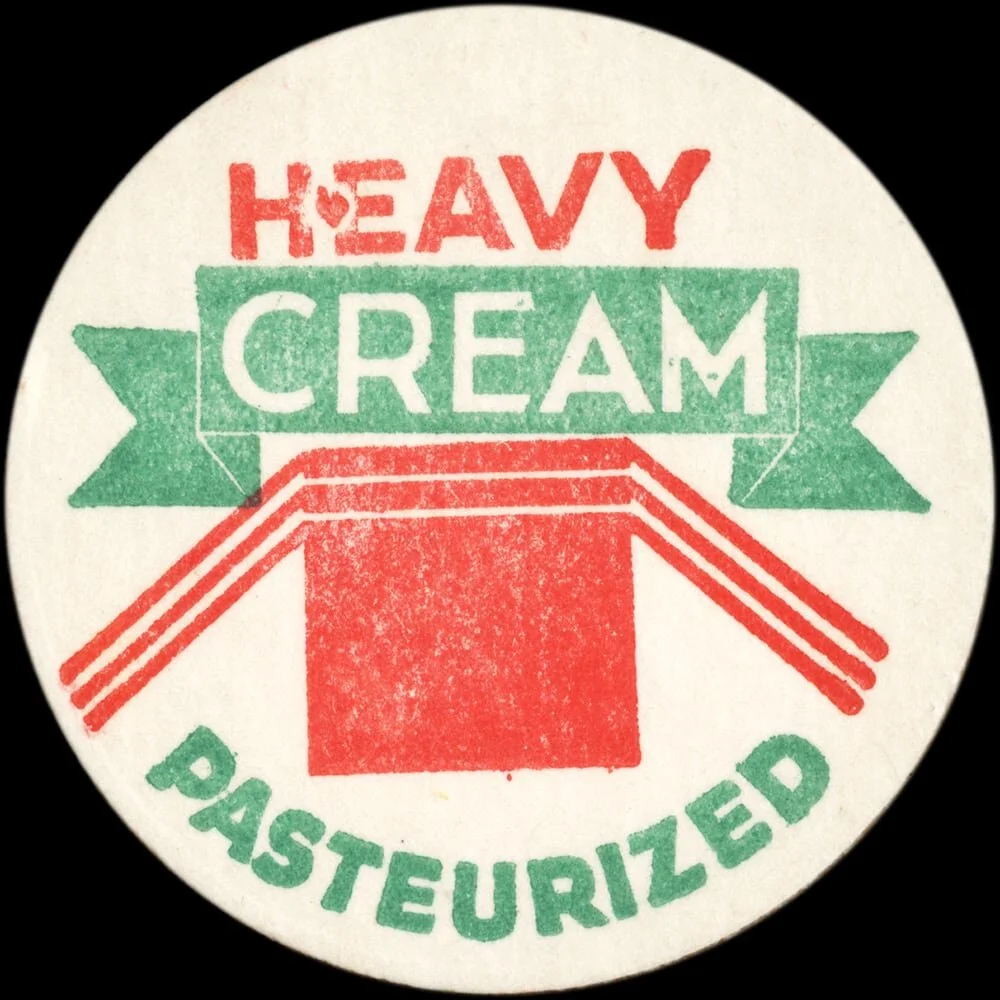
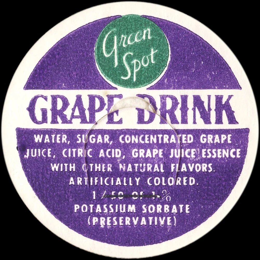
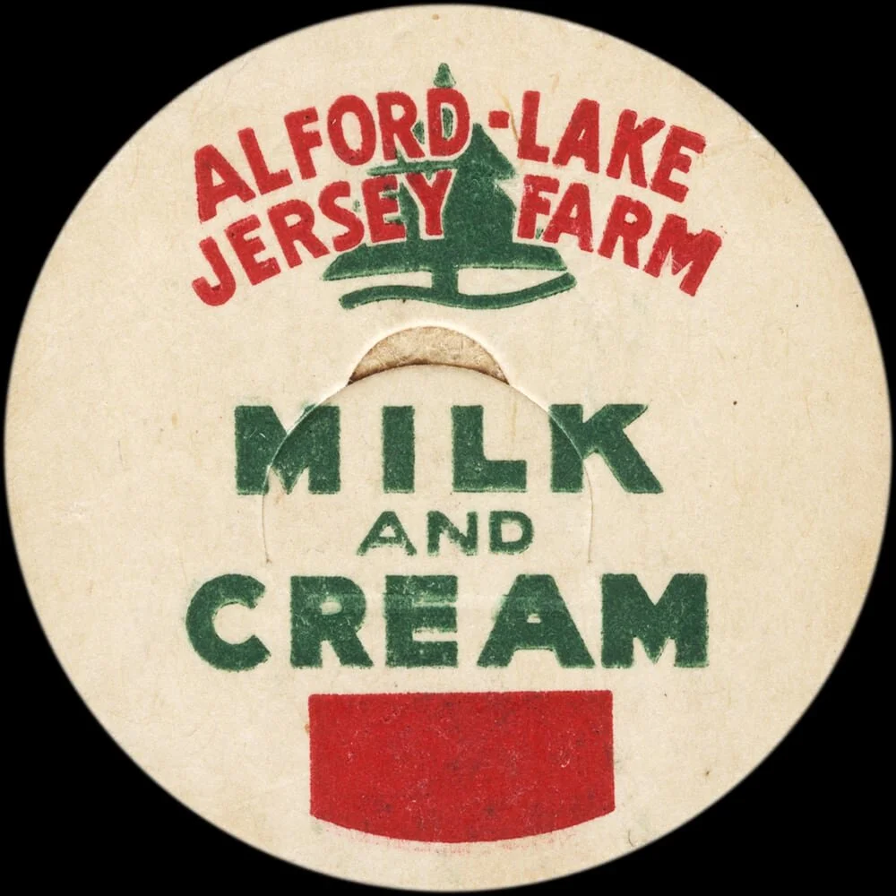
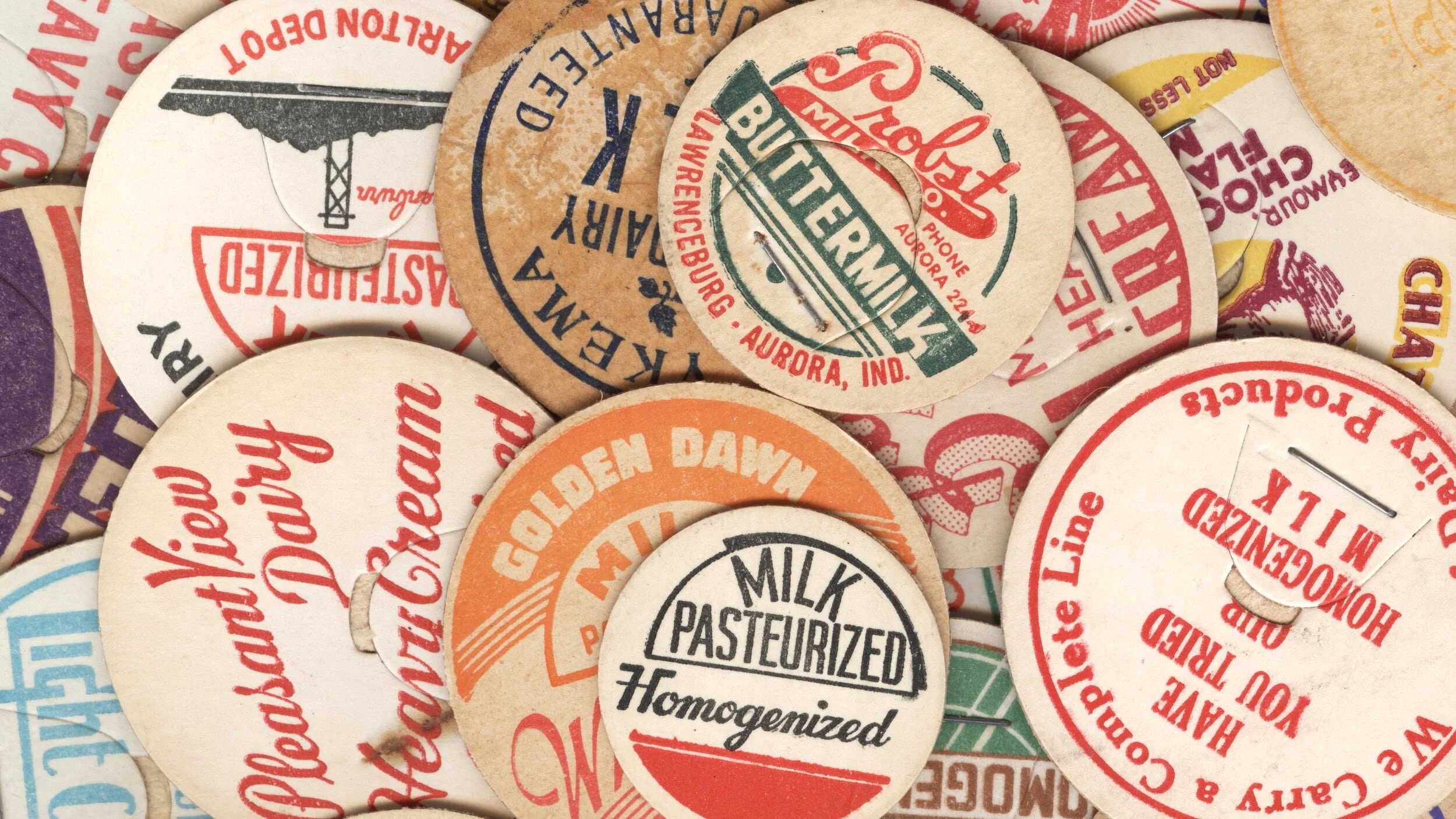
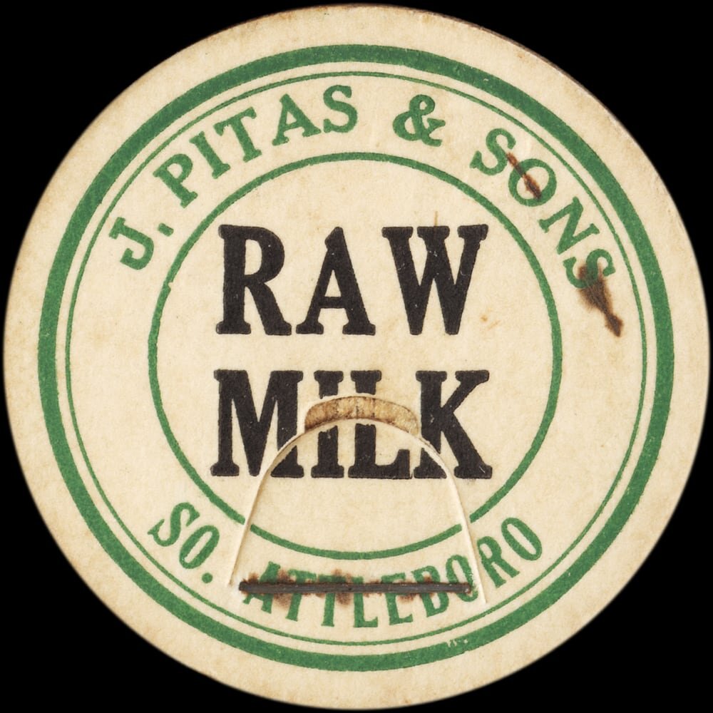
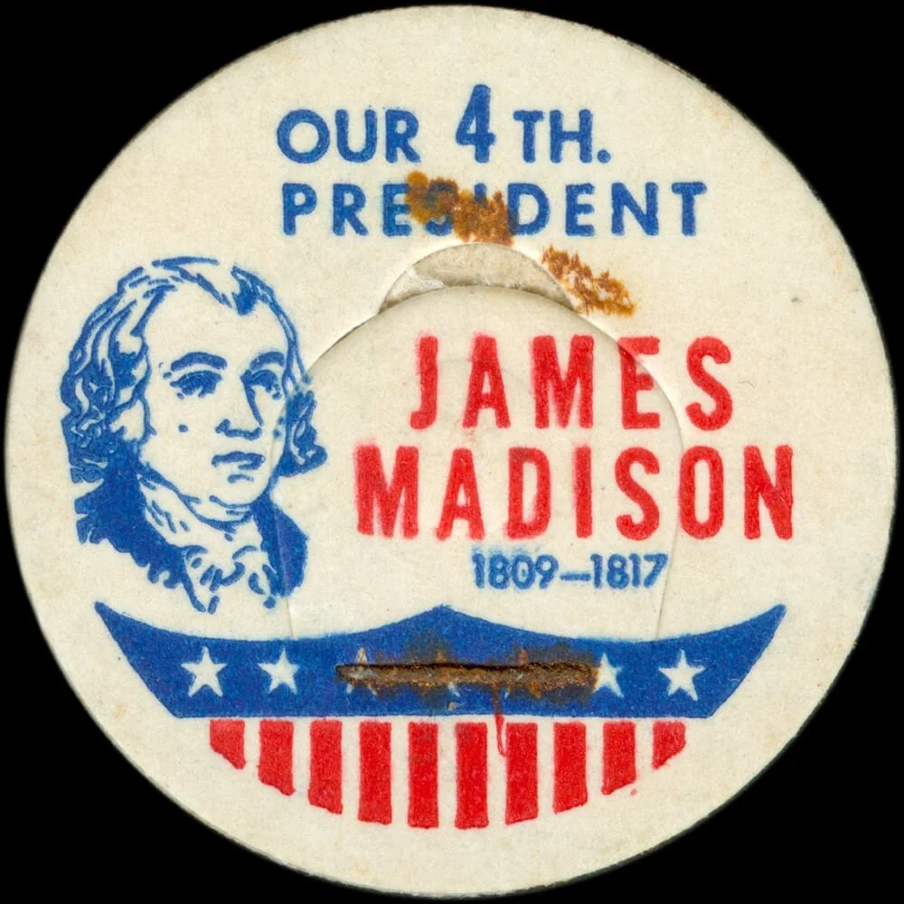
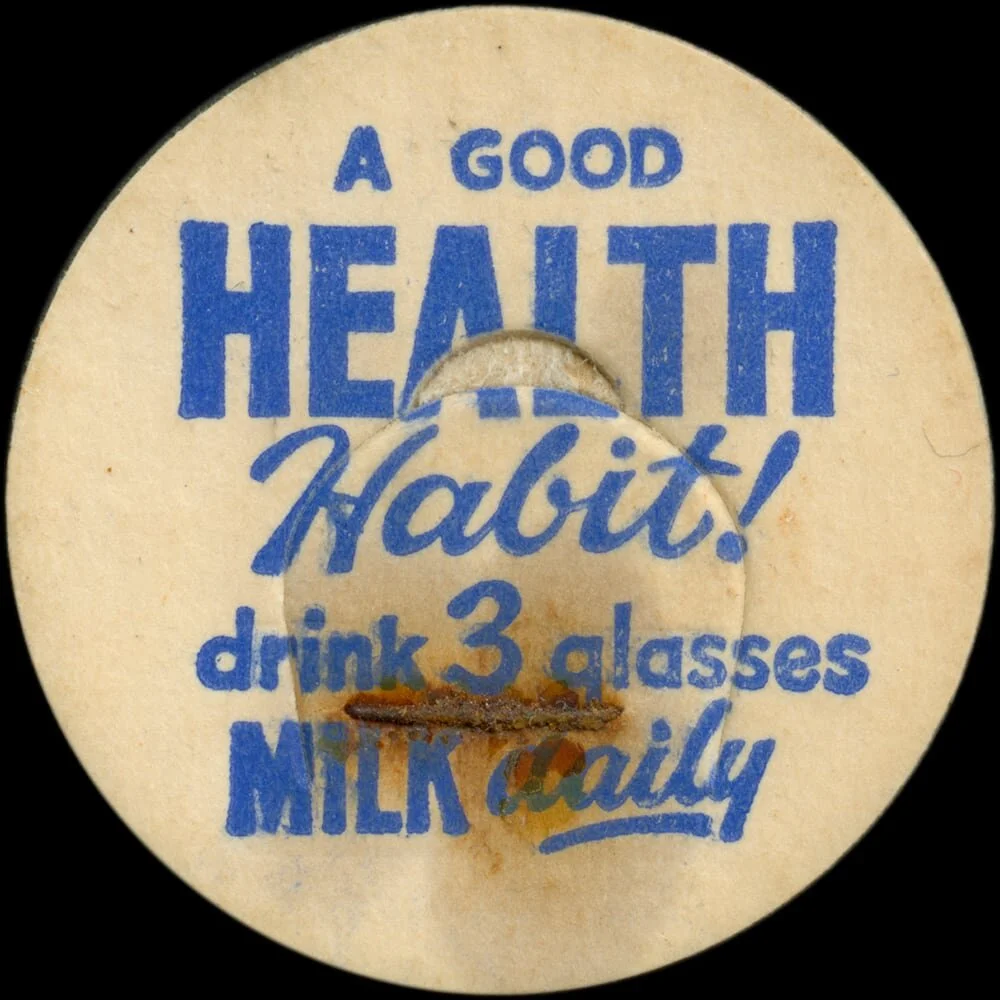
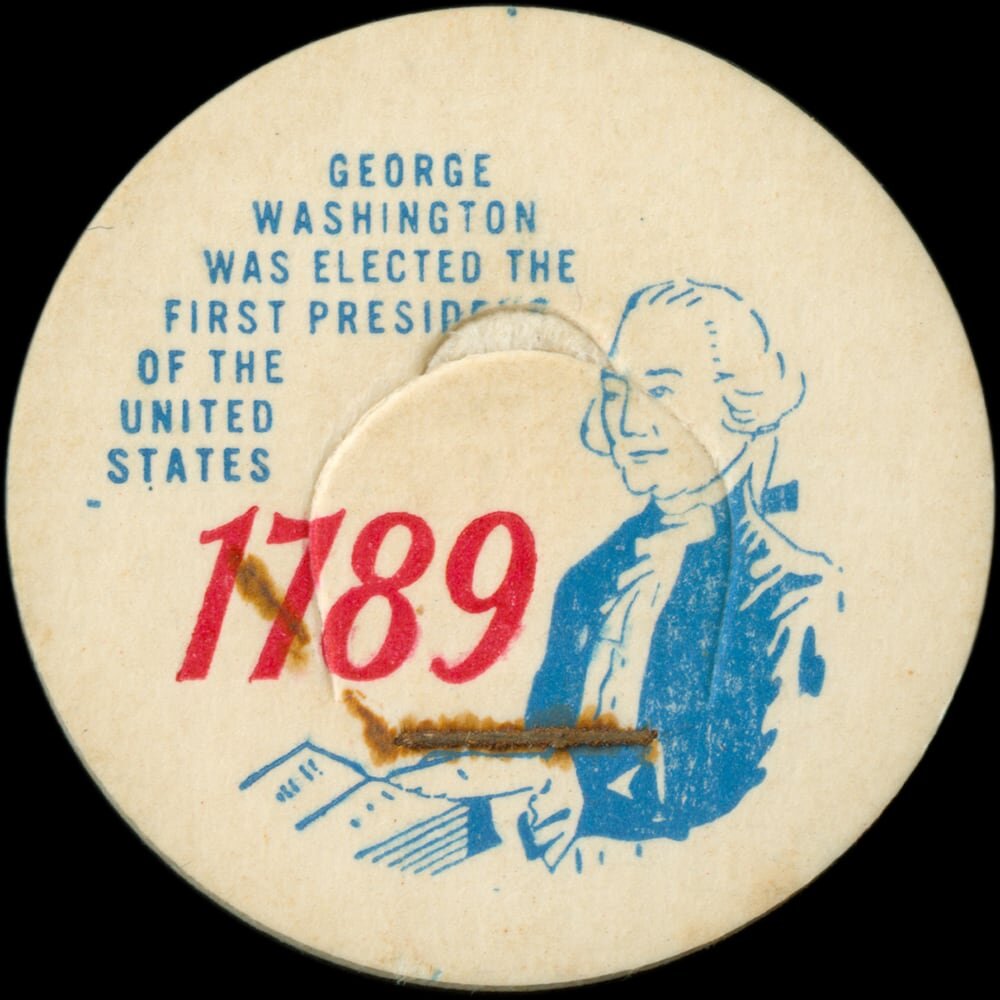
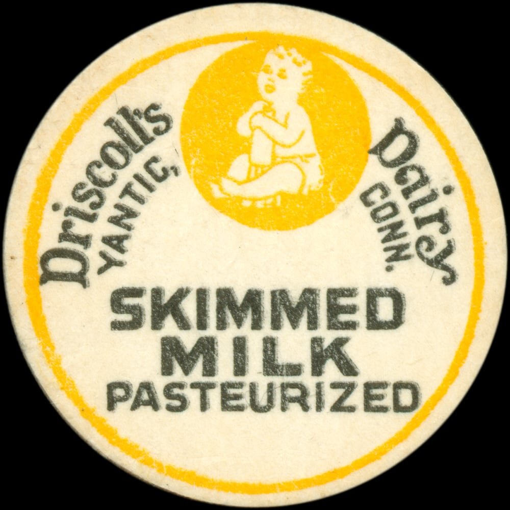
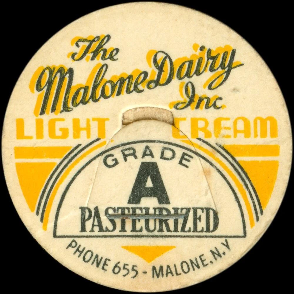
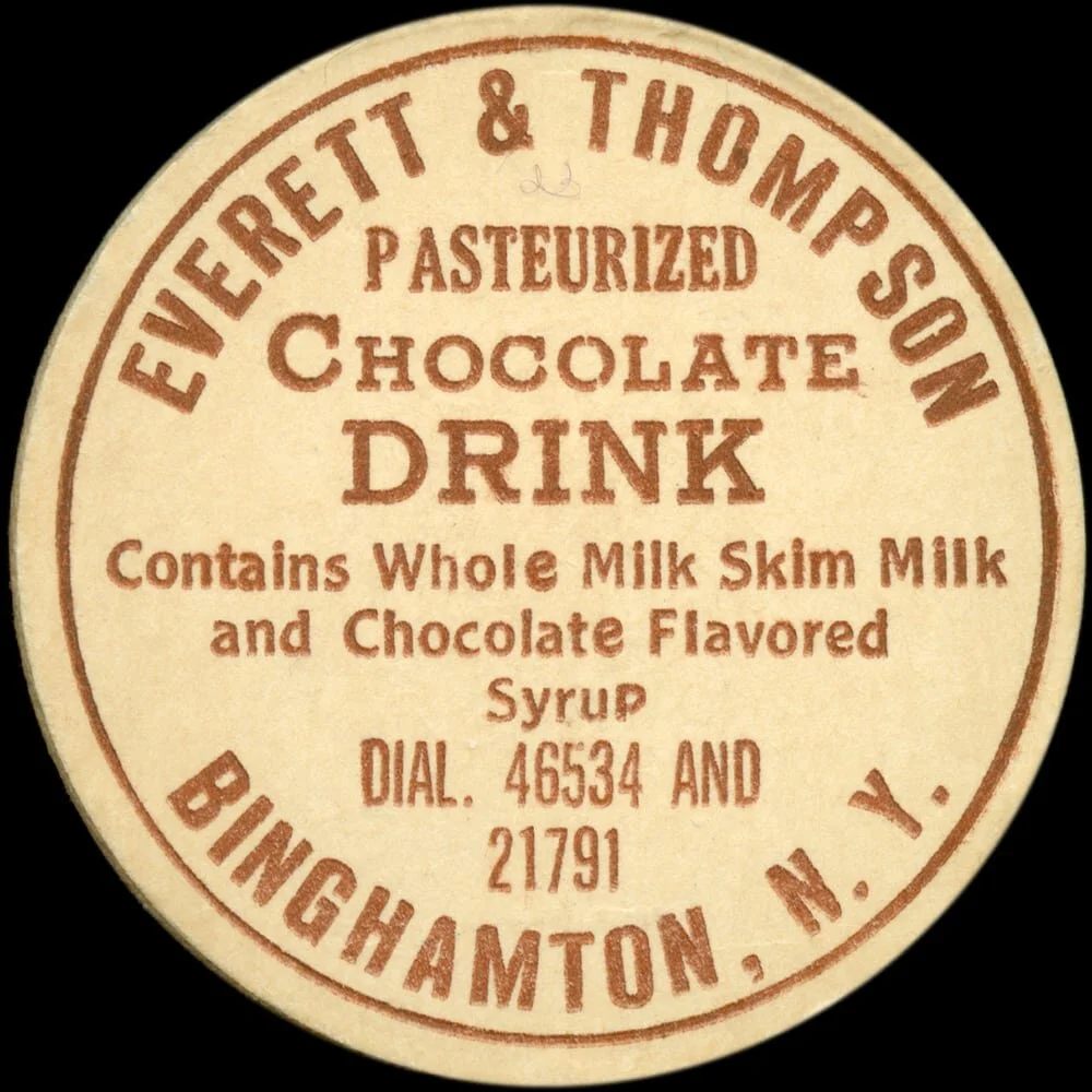
Once a ubiquitous part of everyday life, mid-century milk caps are charming artifacts of nimbly-executed graphic design. They not only utilize energetic typography (as well as illustration), but do so while relying on both an economy of form and a limited color palette.
The artifacts.
Most of the caps here feature New England-area dairies, as they were indeed collected from antique shops or flea markets in New England. Others are farther-flung, sent in by friends, family, and design colleagues.
The project.
Vernacular Circles is a history rescue project put together from Midnight Umbrella. Learn more about the archive’s story as well as behind-the-scenes design process. Have a question? Feel free to drop us a line anytime.
Explore more.
Interested in exploring archives of similar advertising ephemera? We highly recommend the extensive digital collections of the Library of Congress, as well as the Field Notes Memo Book Archive, and Cardboard America. Check them out!